

Goal
Create an check-in experience that fits in the busy routines of event producers. These professionals have to manage the staff and all the guests. Therefore, they need a frictionless check-in which is fast for the guests and at the same time get relevant information about them.
![]()
Research
In the beginning of the project, we had to understand more about the event producer's routine. After some briefing meetings with the Lets.Events team, we were able to create 2 empathy maps. The first one is called André, the owner of a night club, and the second is João, the security guard.
Besides the briefing, we studied the old Lets.Events check-in experience and did some benchmarking with other guest management tools, such as Eventbrite and Sympla. This way we could get some inspiration for designing the new experience while covering all the legacy features.
Check out the André's and João's empathy maps:
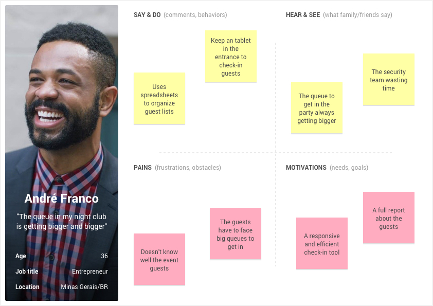
Empathy map: André (Night club's owner)
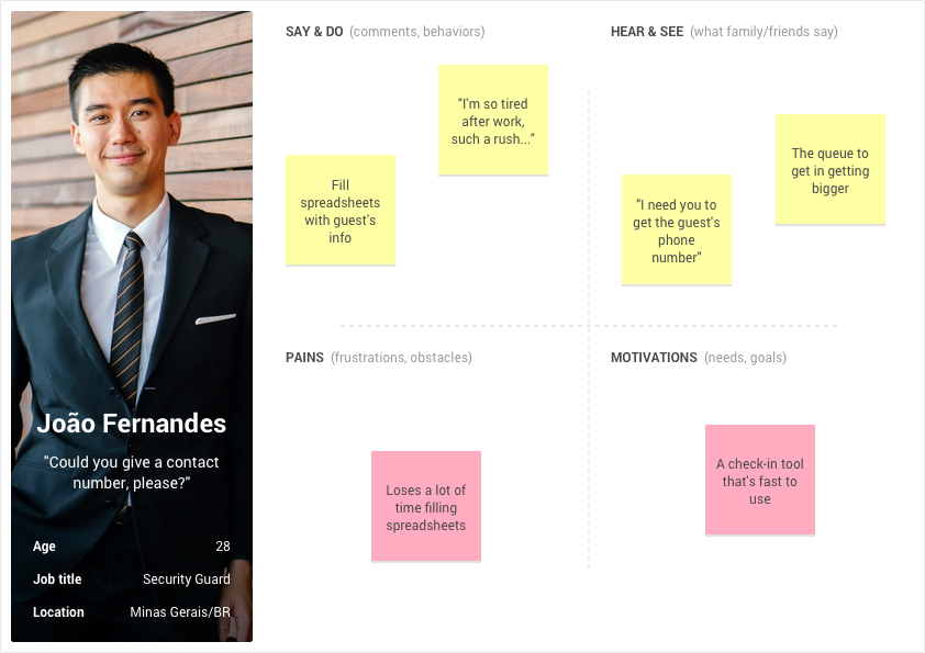
Empathy map: João (Night club's security guard)
![]()
Prototyping
After learning more about Lets.Events business model and about our personas routine, we started sketching some solutions.
The biggest challenge was to create a sort of "distraction less" mode for João, so he could check-in the guests as fast as possible. That's because André needs to keep the line flowing while getting some relevant information about his guests.
In this "distraction less" mode, all the irrelevant information and actions were removed from the interface. For example, in the check-in context, João wouldn't have to worry about editing the sign up form or analysing the last events reports.
Besides this focus mode, the check-in experience should be very flexible and fit most of the screen sizes. Therefore, João could search a guest, review its sign in information, add other relevant information (such as phone, gender, etc) and check-in them with the same efficiency in a desktop, tablet or smartphone.
Check out the prototype of the desktop version:
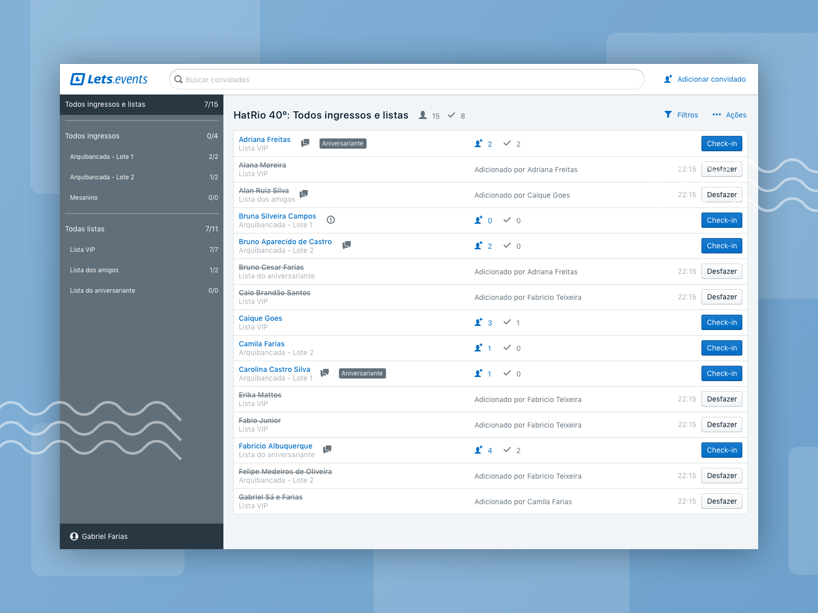
Prototype: Check-in home page - Desktop Version
For the desktop context, the search field and the filters were highlighted, getting a good portion of the screen. Because of that, João could find guest faster, searching for names, ticket numbers and filtering for tickets or guest lists.
Check out the mobile version of the same interface:
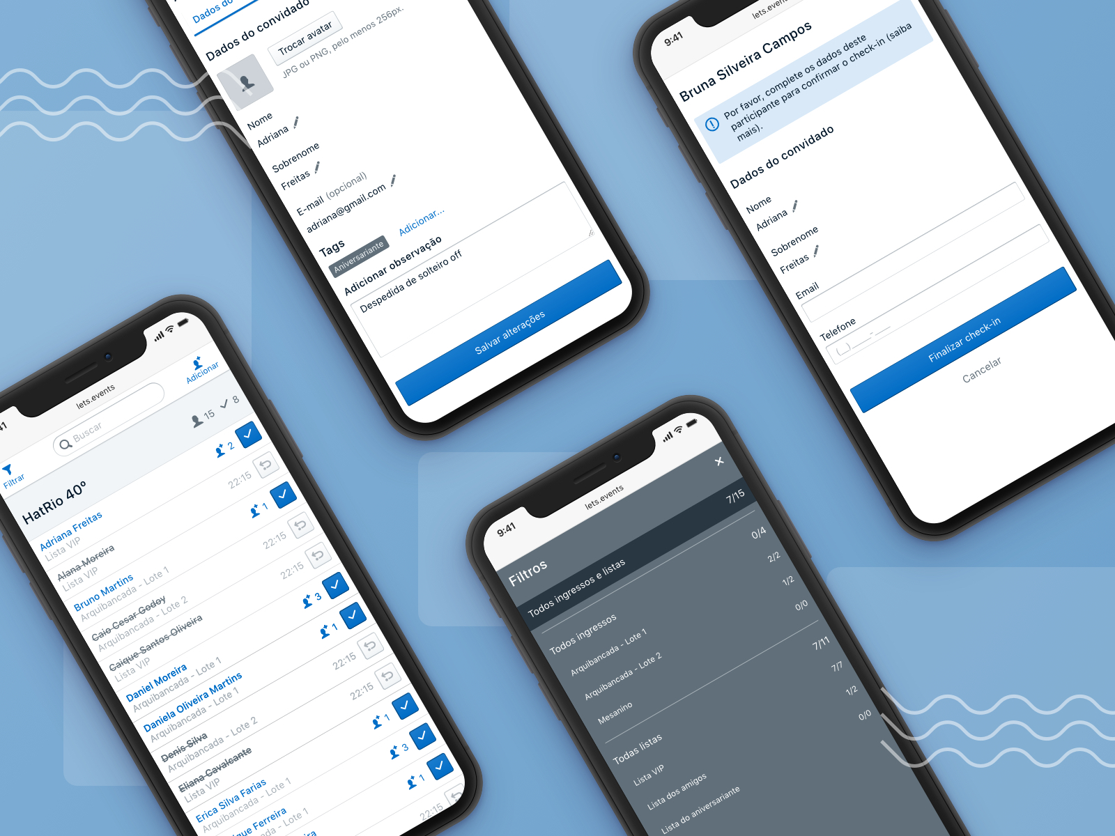
Prototype: Check-in - Mobile version
In the mobile version, the idea of a "distraction less" mode was kept, we even removed the company's logo to get more space for the content. So even in a smaller screen, the practicality of finding guests was the same, with the search field and the filters always visible in the navigation bar.
![]()
Validation
In this project our company wasn't hired for carrying out usability testing or other sort of validation. We only helped the developers to code our prototypes, handing off the assets/documentation and clarifying doubts.
